Coqbull, Cork
Breathing life into a fearless, in-your-face chicken and burger concept
Brand Strategy | Visual Identity
Coqbull is an award-winning upstart in a sea of faceless burger brands. Its fresh and fearless approach attracts younger diners in search of real food with a side order of attitude.
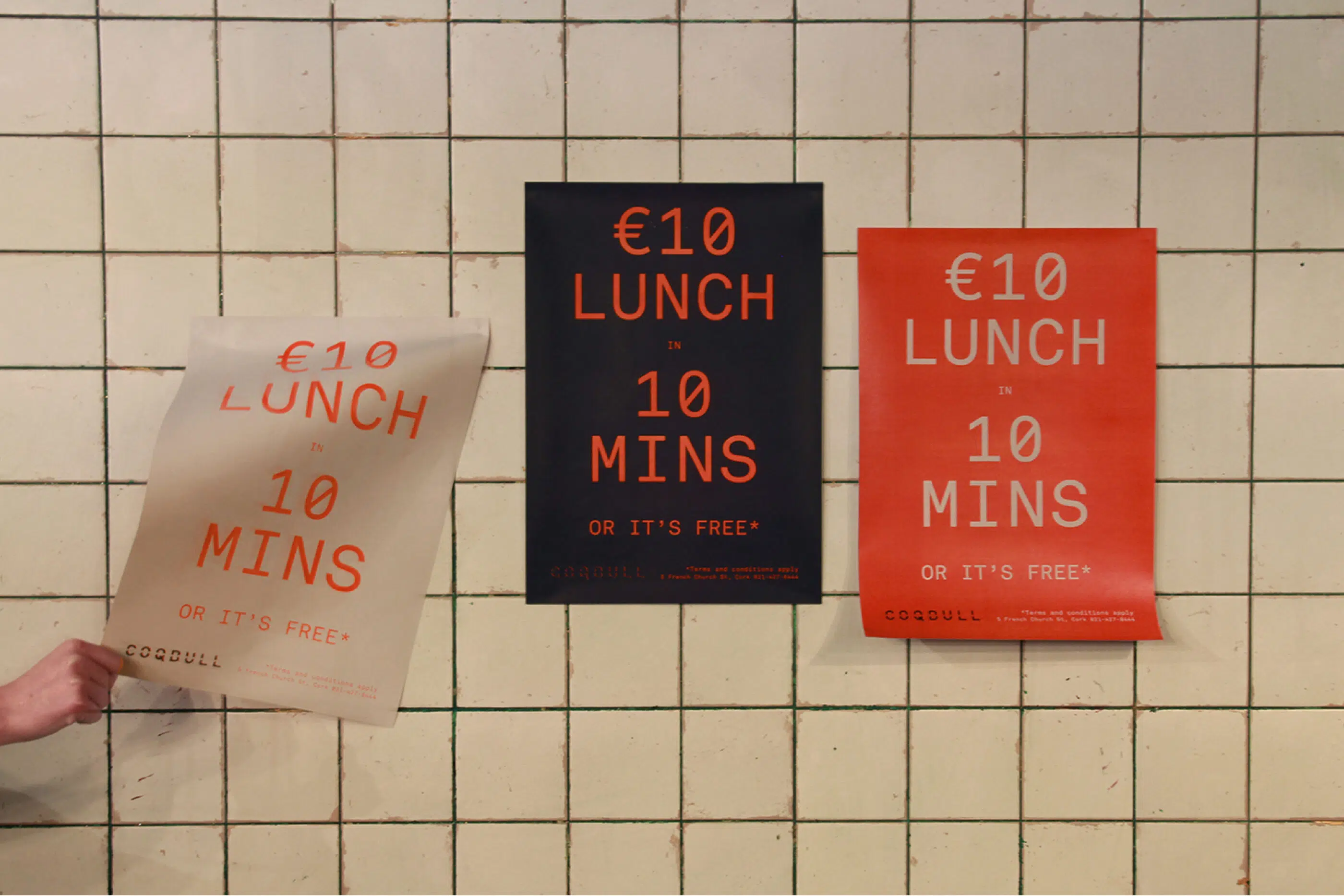
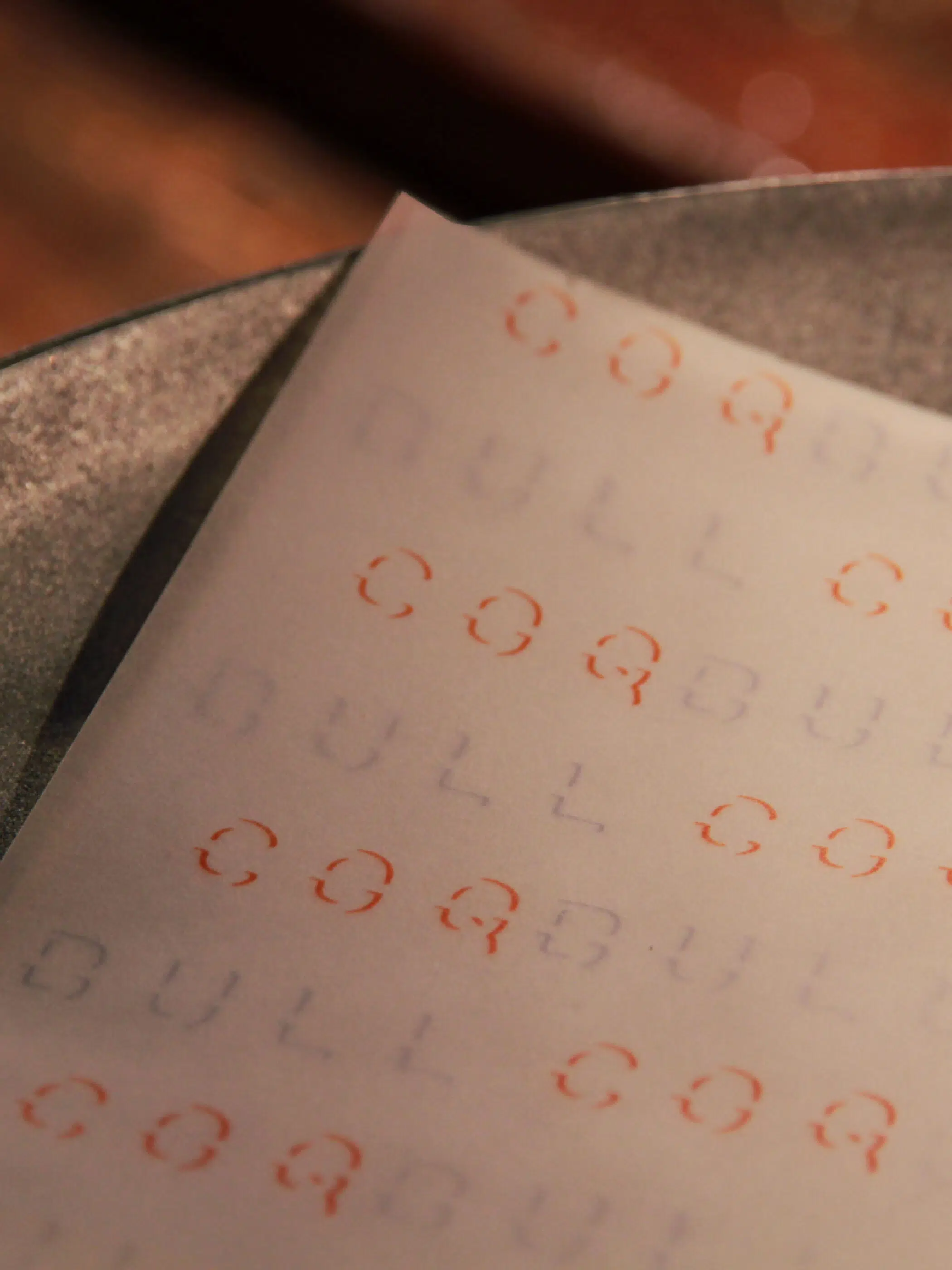
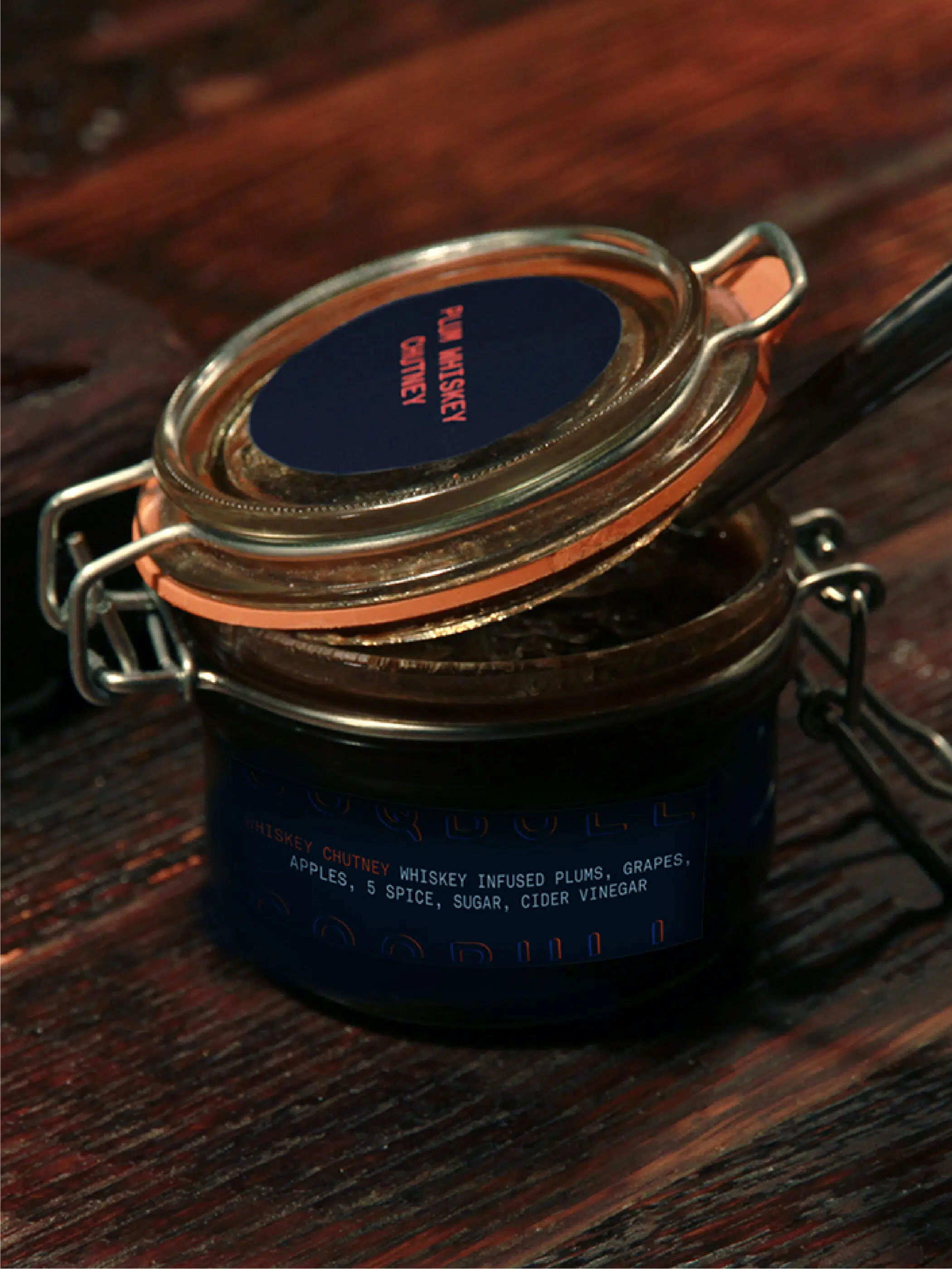
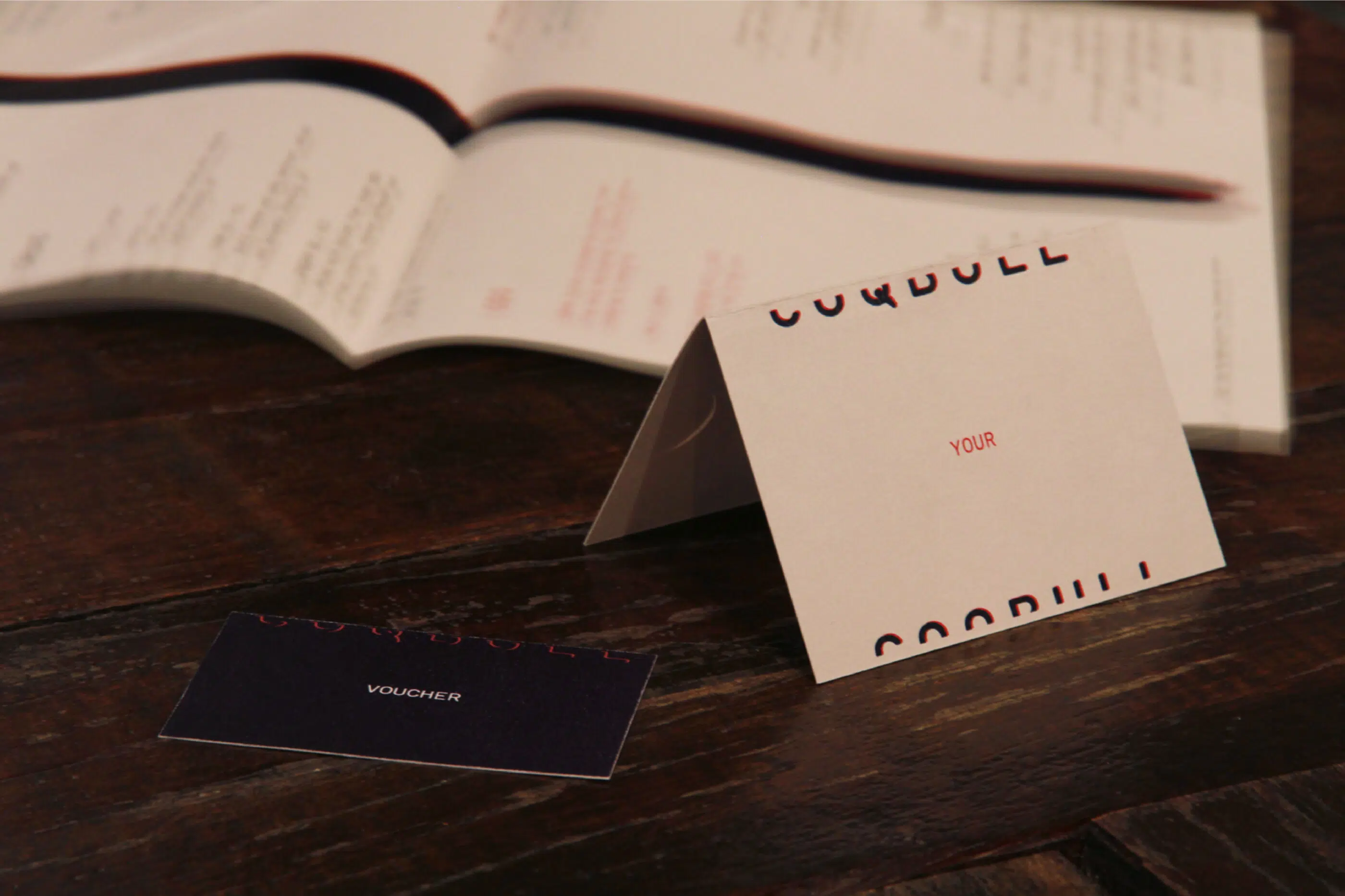
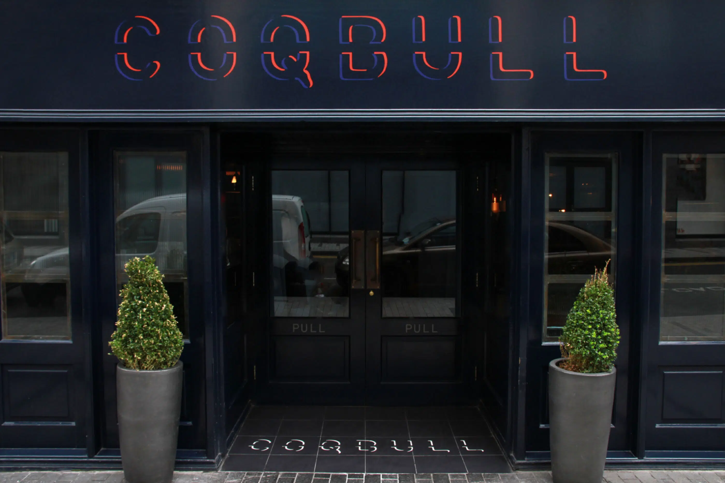
This wild, unruly brand needed an identity to communicate its fun, its fancies, and its flaws. A wordmark edged in vibrant blue and orange is a nod to the grill flames, while a series of splatters and smudges reflects the rubbing, marinating, charring, and burning of the cooking process. And for consistently compelling communications, our Coqbull brand dictionary is essential. It sets the tone for packaging, uniforms, and other marketing collateral.